
Woo Commerce Brand, Automattic
Woo Hoo! A brand evolution worth celebrating.
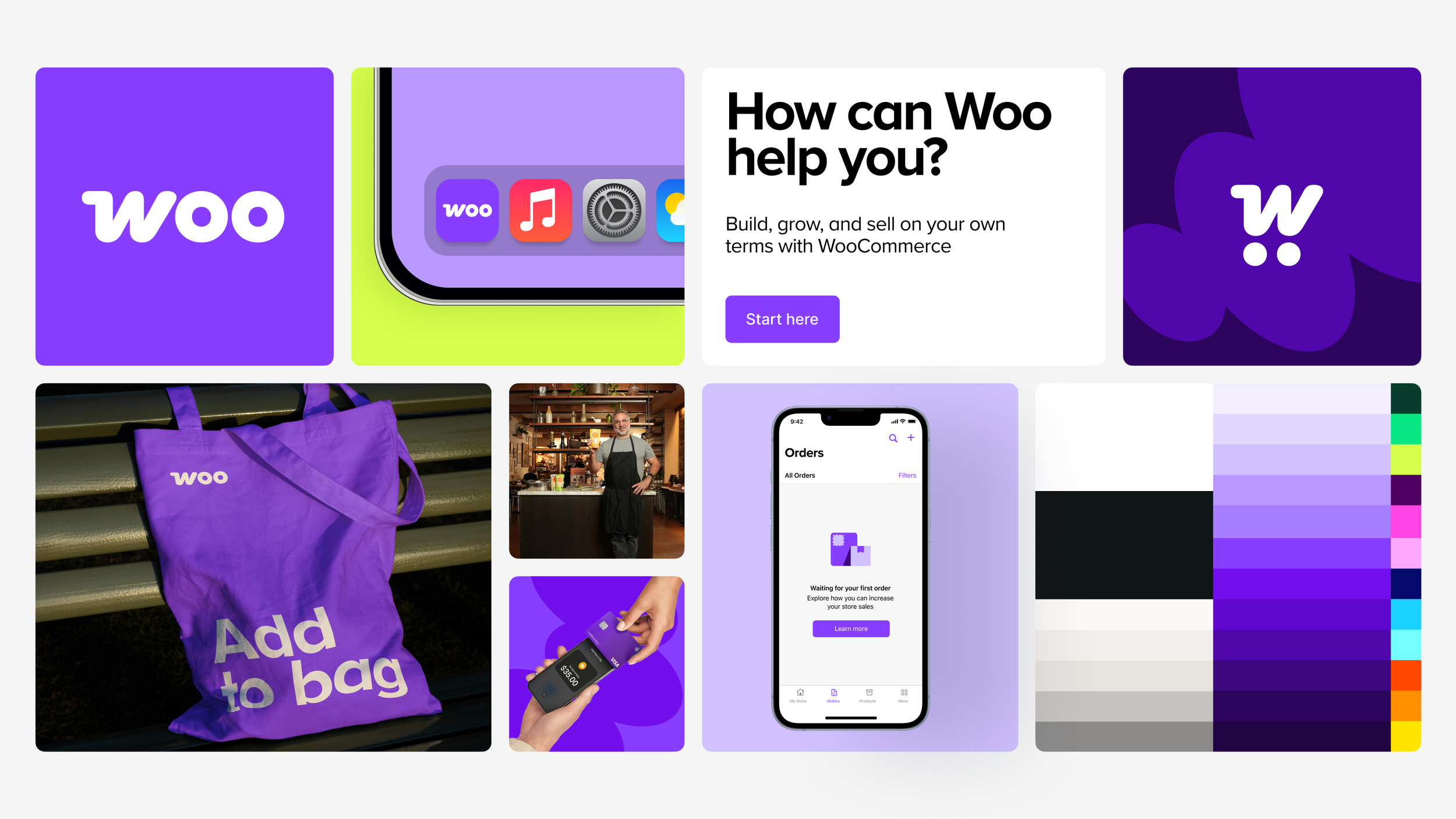
The original WooCommerce logo, assembled in PowerPoint during the company’s early startup days, carried the brand impressively far. Yet with Woo’s unprecedented growth and maturity, it was clear the visual identity needed to evolve alongside its ambitions. The logo, colour palette, and supporting visuals no longer reflected the product's or the community's maturity, confidence, or energy. It was time for a refresh.
My roles
Art Direction
Design


Process
Our goal was to evolve the brand, not reinvent it. Like the post outlines, we wanted to honour the legacy Woo “speech bubble” while modernizing every element around it to feel more cohesive, scalable, and ownable. We conducted visual audits, explored logo refinements, type systems, and motion principles, and iterated across hundreds of design directions. Central to the process was defining the why behind every design decision—what we kept, what we refined, and what we let go.
The team established new foundations: a warmer, more flexible colour system; refined wordmark proportions for better legibility; an expanded iconography and illustration style; and guidelines for motion, photography, and spatial use that reflected Woo’s balance of playfulness and professionalism. I contributed to design direction, documentation, and rollout planning to ensure the updated system could flex across product, marketing, and community touchpoints.
This wasn’t just a quick wardrobe change — it’s the result of a ton of collaboration across the company, and I couldn’t be prouder of the outcome. We designed this brand to stand out from our competitors in how we look, what we believe, and how we communicate our value. It’s a reflection of the exciting future we’re building.
Tamara Niesen, CMO, WooCommerce
Introducing the new Woo: A revitalized brand for a new commerce landscape
Design system
We launched the refreshed identity in tandem with a new brand site and messaging framework. The updated logo family and colour palette unified the ecosystem across extensions, documentation, and campaigns. The refresh also introduced expressive type pairings and motion language to give Woo’s personality more energy and life—capturing what made Woo beloved while aligning it with Automattic’s broader design system
Outcome
The new Woo identity landed as both familiar and fresh—instantly recognizable, but unmistakably evolved. Internally, it reignited pride in the brand; externally, it signalled Woo’s continued leadership in open-source commerce. The refreshed system improved accessibility, streamlined asset creation, and created a more cohesive visual experience across platforms.
This rebrand wasn’t about chasing trends. It was about designing for longevity—building a system that could flex as WooCommerce’s future growth unfolded.
Read my next case study:
